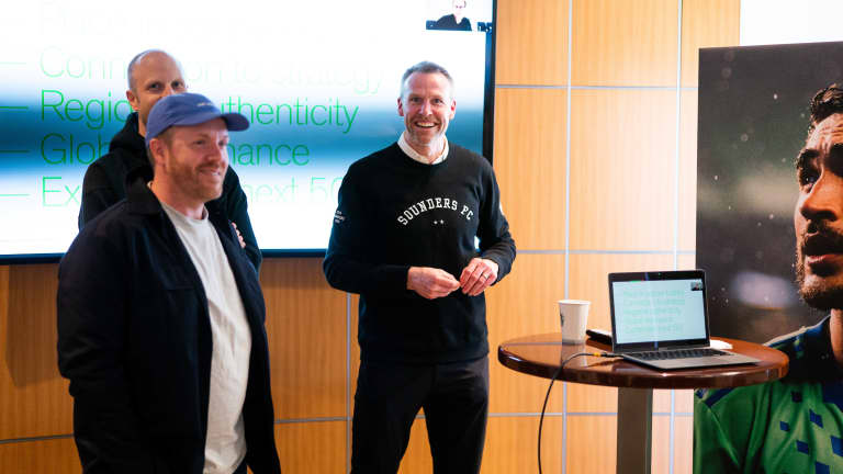
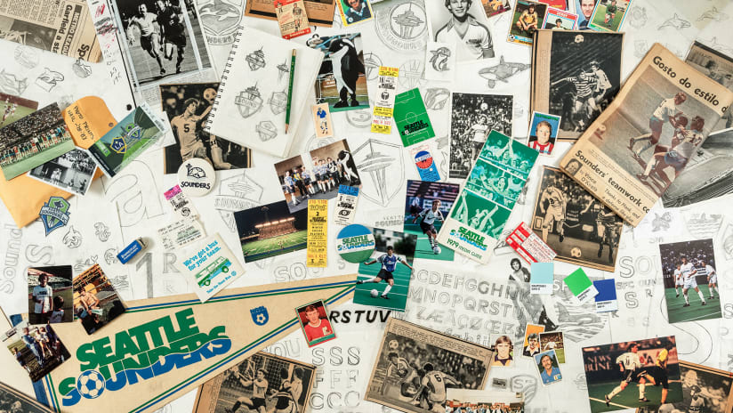
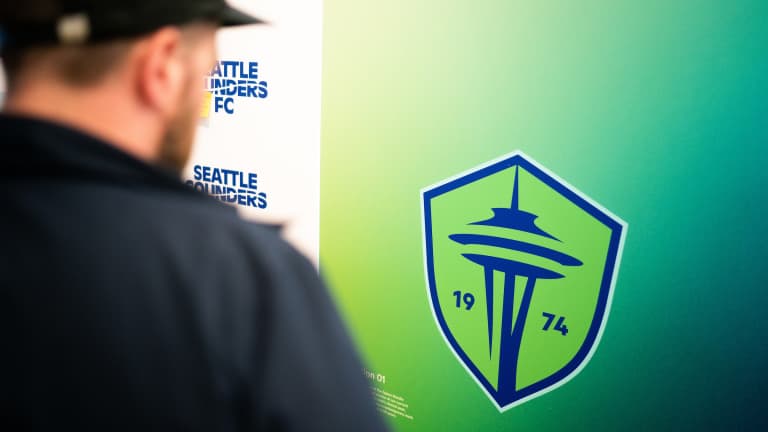
On Tuesday, Seattle Sounders FC unveiled its evolved visual identity. It was the culmination of nearly two years of work behind the scenes, tapping into the rich history of the organization dating back to 1974, and driven by the feedback received during a comprehensive fan engagement process.
The new identity system was created by Column, a Seattle-based design consultancy specializing in brand identity. The majority of their work is focused in sports, tech, food & beverage, and hospitality. They have partnered closely with the Sounders organization for the past five years on various branding initiatives from the in-stadium matchday experience to the Jimi Hendrix and Bruce Lee kit launches.
"The role that Column played in bringing a local lens and a fan lens has been instrumental in unlocking the brand system that has been created,” said Seattle Sounders Chief Revenue & Marketing Officer Taylor Graham.
New York based creative agency Athletics was also a major asset in the creative process of the brand evolution. Their expertise in elevating brands through design, strategy and comprehensive research made it an easy decision to bring them onto the project.
From Column and Athletics establishing the brand design of the new markings, initiating the fan and market research of the launch with the help of other agencies DNA and Name and Number, and working together with the front office and marketing staff of Sounders FC to bring ideas to life, it was a joint effort from beginning to end.
“The work that our community will see was brought through the creativity of this full team,” said Graham. “The club put together what we believe was the dream team.”
But Column’s connections to the Sounders and Seattle soccer run deeper than their work with the club.
Column’s three co-founders – Matt Fagerness, Tony Ciocca and Richard Williams – were classmates at Western Washington University. All three hail from the South sound and became fans of the Sounders at different points growing up. Ciocca, who has been a Season Ticket Member since the club’s inaugural MLS season in 2009, used to draw sketches of new crests for MLS clubs to help pass the time during school.
Fast forward to present day, Column has become an integral partner of the Sounders, especially in helping elevate The Jimi Hendrix Kit and The Bruce Lee Kit into two of the most successful jersey launches in MLS history.
After engaging with fans for months, the club listened to feedback and began to explore the possibilities of a brand evolution. It was a natural choice to tap Column to participate in his process given their comprehensive knowledge, track record, and deep affinity for the Sounders.
A reimagined brand identity system was in the hands of Fagerness, Williams and Ciocca.
As fans themselves, the three knew it was crucial to ensure the people that make up the Rave Green feel “connected to the brand at an intimate level.”
“The fan reaction was obviously at the forefront of our minds this entire time,” said Ciocca. “We've always felt pretty strongly that there was so much rich history that wasn't tapped into when [the Sounders] redid their brand for their MLS launch and so in a way there was an opportunity to make it feel more like the Sounders than it actually did.”
He continued, “Rather than reinvent something, the goal was to refresh it and amplify its good qualities and when it's executed correctly, with care and precision, it should feel even more true to the entity than it did before.”
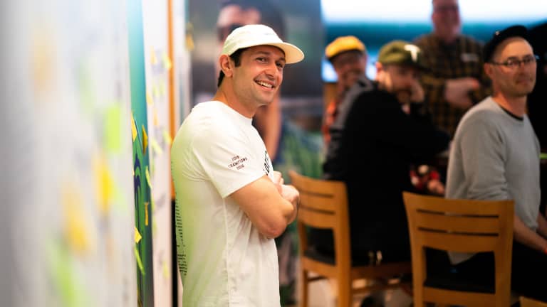
The Seattle Sounders are a local club with global ambition. By bringing together an agency like Column with deep connections with Seattle, and Athletics, an agency with a proven track record of evolving international soccer brands, the Sounders were able to establish a perfect balance for their brand.
“Working with Column was pretty seamless from day one,” said partner and creative director of Athletics Malcolm Buick. “We kept each other on the straight and narrow with one side as an outsider perspective, and one side on really knowing the club and knowing what the fans will respond to.”
Column and Athletics underwent a series of interviews with various fans and stakeholders in order to fully understand what it is people are looking for in the club’s visual identity.
“It was a really collaborative process,” said Ciocca. “We brought groups of people in to look at some things and give some feedback and it wasn’t just the ownership group and the internal team, but the community at large.”
Determining what shade of green was considered “Rave Green” was among the many topics of discussion. Showcasing traditions like the handing out of the carnation was also a subject of conversation.
Through these conversations, Athletics led the creative brief driven by fan participation insights. The creative agency used the brief to inform their own internal design teams while also continuing to work with Column on how to hone in that storytelling aspect into the markings.
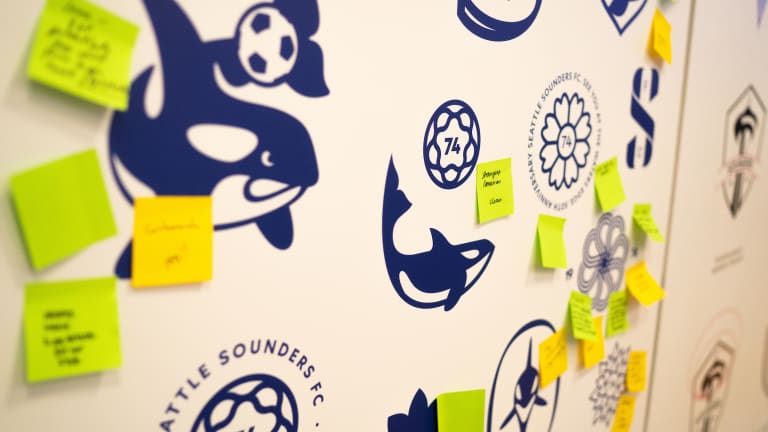
But, it was Column who grabbed the reigns in the final moments of the process.
“Our designers were very much part of that journey as well, but at the end of the day, someone had to kind of go on and continue that charge and so the Column guys took it to the finish line,” said Buick. “And we continued to work alongside them to get to the final marks and decision there.”
From incorporating the wave motif from the original NASL crest and APSL logo into the new wordmark, to including the Space Needle from the current mark, there was a heavy emphasis on “paying homage to each era of the club,” according to Williams.
“There's a different entry point for young and old fans, so I think there’s something special for everyone,” he said.
It was a daunting task to utilize all the shared advice and check all the boxes from those that collaborated in the project, but it was necessary, in order to achieve a brand identity that was meaningful and authentic to Sounders fans.
“There were so many inputs, but it should be that way because it’s everyone’s club and we want to involve those people in that process,” said Ciocca.
And the Column squad hope the new marks resonate that same messaging for the rest of the community as well.
“Every mark that was created in the system serves its purpose,” said Fagerness. “And I think that it will just be exciting to see sort of how they manifest themselves in the real world and what the fans gravitate towards.”
